1406 Adventures
A Variant-Comparison Prototype for a Luxury Travel Advisory
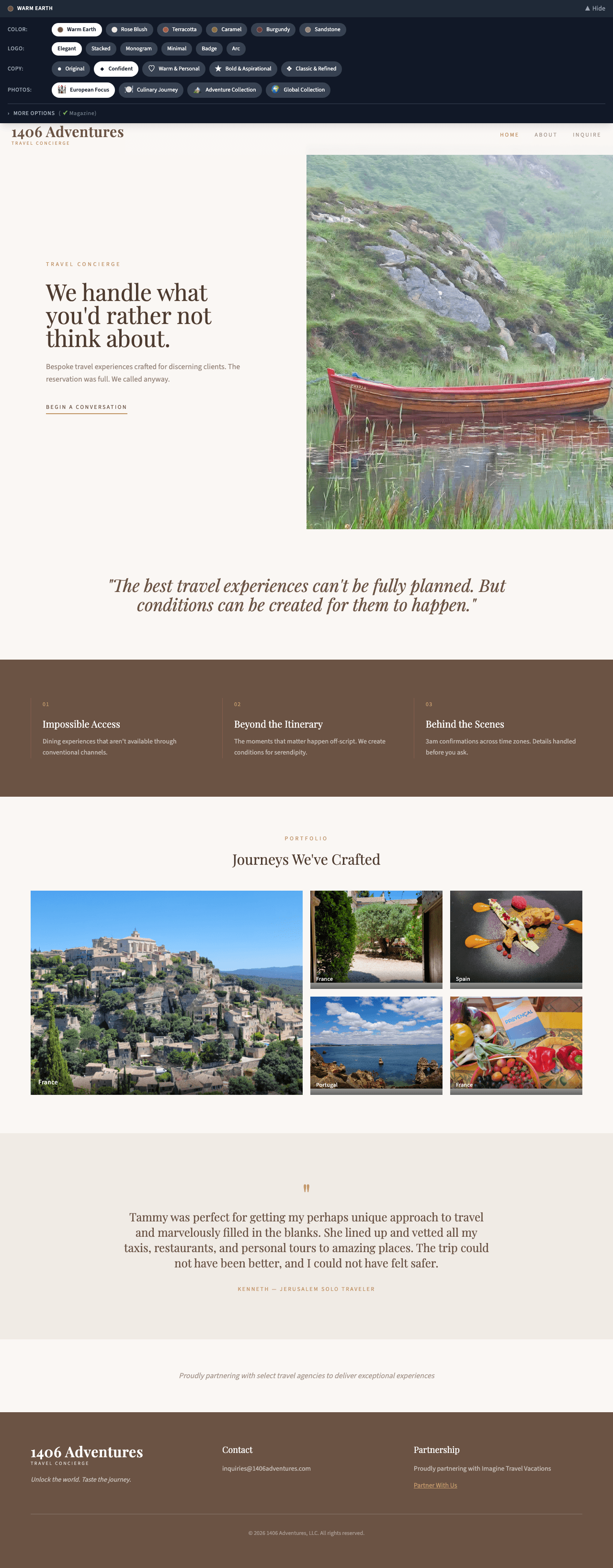
A marketing site for a luxury travel concierge, built as a comparison prototype rather than a mockup. Three layout systems, four brand-voice shells referenced against established players in the category, and swappable copy tones and photo sets — all live in the running site, so a non-technical client could pick a direction by toggling between real options instead of reviewing static comps. Written up as a PRD first, with two user journeys and an agent-referral attribution path.
The Problem
The business runs two entirely different acquisition paths — cold visitors who arrive from search and word of mouth, and warm clients referred by partner travel agents who need to feel acknowledged and whose referrals need to be attributed. A single undifferentiated brochure site serves neither, and the agent side has the additional constraint that partners will not adopt anything requiring a login or a portal.
Research & Discovery
The two journeys came from how the business actually acquires: organic visitors who need credentials and trust-building before they inquire, and agent-referred clients who arrive already warm and need acknowledgment that they're in the right place
The agent constraints — a simple memorable link, confidence that referrals are tracked, and no login — shaped the attribution design more than any technical consideration did
Strategy
Choose By Using
Layouts, voice treatments, copy tones, and photo sets all switchable in the live site — not three flat comps in a meeting.
Two Doors
Organic visitors and agent-referred clients get the same content, with acknowledgment and attribution on the referred path.
No Partner Portal
Referral tracking is a link parameter. Agents will forward a link; they will not maintain a login.
Maintainability First
The platform decision was made on who edits the site after launch, not on what's most interesting to build.
Key Decisions
Made the platform decision on who maintains the site rather than on what's most fun to build. The client is non-technical and the site has to be editable without a developer, so the PRD specifies a managed platform even though a custom build is the more impressive artifact
Built comparison into the running site instead of producing static mockups, because a client choosing between three images chooses on taste and a client choosing between three working sites chooses on fit
Kept every photo set covering the full destination range, so a variant couldn't win on photo selection when the thing being tested was layout and voice
Specified referral attribution as a URL parameter with no agent-side login. Partners will forward a link they can remember; they will not maintain credentials for someone else's referral portal
Results & Impact
3
Layout Systems Built
4
Brand Voice Treatments
2
User Journeys Specified
- Wrote the PRD first — product summary, business context, two mapped user journeys, and an explicit platform decision made on client maintainability rather than developer preference
- Built three complete layout systems (minimal, bold, magazine) as swappable shells rather than as separate mockups
- Built four brand-voice treatments benchmarked against established luxury travel operators, plus a recommended default, so the direction could be chosen against real category references
- Made copy tone and photo set runtime-switchable through context providers, with every destination represented in each photo set so the comparison tested layout and voice rather than which photos happened to be nicer
- Specified the agent-referral journey as a plain link carrying a referral parameter, with acknowledgment on arrival and attribution captured on submit — no partner login, no portal, nothing for an agent to learn